Heineken
http://www.youtube.com/watch?v=S1ZZreXEqSY
I love seeing guys act in the stereotypical female role. Two similar types of excitement over two very separate things. I enjoy the uncovering of a human truth that often occurs between men and women.
E-Trade
http://www.youtube.com/watch?v=lEXZ2hfD3bU
Who can't resist a hilarious talking baby? Especially when it reinforces the brand and its best attribute: E-trade is so easy, even a baby can do it.
Milky Way
http://adsoftheworld.com/media/tv/milky_way_simply_caramel_pool
Advertising Agency: BBDO NY, USA
Chief Creative Officer: David Lubars
Executive Creative Director: Greg Hahn
Creative Directors: Scott Kaplan, Tom Kraemer
ACD/Copywriter: Mike Sweeney
ACD/Art Director: Molly Sheehan
Agency Producer: Theresa Ward
Director: Simon Cole
Production Company: HSI
Editorial Company: Cosmo Street
Editor: Lawrence Young
Visual Effects: a52
VFX Supervisor: Andy McKenna
Sound Design: Soundlounge
Sound Designer: Tom Jucarone
Color Correction: CO3
The excitement is all built up, just to see first the reactions of the audience and then the perfect, exaggerated scene. Taking a very usual and seemingly everyday event and turning it into something spectacular.
Monday, April 26, 2010
Sunday, April 18, 2010
My Best Ads


Name of Ad: Event Case Study Print Campaign
Client: Hallmark
Target Audience: People looking for all types of cards for all types of events
Single Most Important Point: Hallmark has cards for all types of people to help them leave a good impression


Name of Ad: Outdoor Guerilla Copy Campaign
Client: Burt's Bees' Lip Balm
Target Audience: People that care about their lip health
Single Most Important Point: Burt's Bees gets you and your lips, we know how to keep them healthy and looking good

Name of Ad: Running of the Bulls One-off Print Ad
Client: Garmin GPS
Target Audience: People that need to get places safely and fast
Single Most Important Point: Garmin will navigate you out of the toughest situations, including the ones your life depends on
Art direction intent: Ad shows a guy in Spain participating in the running of the bulls event faced with numerous charging bulls he must maneuver and get away from. He is holding Garmin GPS in order to do this.

Name of Ad: Fetish One-off Print Ad
Client: Gold Bond Foot Powder
Target Audience: People with smelly/itchy feet
Single Most Important Point: Gold Bond gets the job done and has got a great sense of humor

Name of Ad: Hometown Travel & Tourism One-off Print Ad
Client: Fayetteville, NY
Target Audience: People looking for a place to get away
Single Most Important Point: Old people have kept Fayetteville very unchanged and traditional, but we appreciate it because it's a nice place to get away and enjoy nature, family, etc.
Saturday, April 3, 2010
Radio Spot Example
Toyota
Toyota Prius - "Liger"
:60 second radio
Creatives: Nicholas Bong, Peter Megler
http://www.youtube.com/watch?v=8I11jjIIRPI
I enjoy this radio spot. I think it might work better as a 30 second one, however it takes a Liger and juxtaposes it to the Toyota Prius. The calmer tone and more sophisticated voice used is a nice break from the loud and often rambunctious radio spots I have often experienced. Where the second voice breaks the rhythmic first voice, it gives the consumer some comedic relief; something they can go and tell their friends about and imitate. However, again, my favorite part is using the facts of the liger in a metaphoircal sense to compare to the facts of the prius. What an interesting concept.
Wednesday, March 31, 2010

Saturday, March 27, 2010
Travel & Tourism Themed Ads
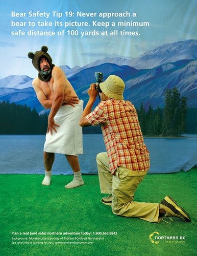
http://farm3.static.flickr.com/2029/2073648933_1a7ea40e93.jpg
The humorous element strikes the consumer in this particular ad. Simply the fact that a human male is playing the role of the bear caught off-guard provides a metaphor for how the bear actually does feel, while supplying the solution to having a safe trip. Many people like the associated risk, but need to know Northern BC has their back.

http://www.theage.com.au/ffximage/2006/03/11/agtourism_wideweb__470x317,0.jpg
I think this captures the Australian spirit and is part of an excellent campaign. Unfortunately, it can have negative consequences for certain countries in which the use of the words "bloody hell" would be extremely taboo and/or very inappropriate.

https://blogger.googleusercontent.com/img/b/R29vZ2xl/AVvXsEjn3ZSgcqgtmwc4o-4M1n8XAHU1mSkcA6u0VPwiFfrbt8NSPyBXNuOxRU0rDEWAEuiNMltD7EQwVlx2DOjz2KXSObDZOKX7ipH5qSLeTzYbbT8o55L_iopi0p72MR9Viqo1FWAnULCT8bNN/s400/alberta-travel-ads.jpg
This is a form of advertising for Alberta, Canada. As more of a guerilla tactic, I believe the consumer would be extremely wowed by this real, life-sized chairlift that will put them in the mood for some Alberta skiing. It's a great way for them to get a "feel" of the product/service and picture themselves using it.
Monday, March 8, 2010
Burt's Bees: Print Ads

Bees fly from flower to flower collecting pollen, assisting them in helping to give you healthy lips.

Burt's Bees contains honey, which is actually bee spit. A provocative way of seeing its benefits!
Keurig: Print Ads (Sketches)

Most ordinary coffee makers require a pot in which the coffee filters into. Keurig has amazing technological advancements that make your life easier. The filter is already in the cup and there is no pot needed. It's a different type of thinking...for the new breed of coffee enthusiasts.

Keurig coffee maker provides you with quite the large assortment of hot beverages to choose from. It's also gourmet; as if you have an entire Italian coffee bar in such a small package. Unfortunately, the handsome or beautiful (whatever your preference!) barista is sold separately.
Gold Bond: Print Ads (Sketches)

USP's of Gold Bond: it stops the itchiness and it keeps your feet dry. Parody/exaggeration: Did you know Moses parted the seas with the help of Gold Bond?

Don't let gross feet keep you from...doing what you love! Definitely a suggestive advertisement.

Human truth: dogs like to lick feet. No matter how smelly or gross they are. So when these dogs would need to be paid a million treats to lick your feet, you know you've got problems. Gold Bond has the solution.

When you've got scaly, itchy, red and irritated skin, you are embarrassed to wear flip-flips and other revealing shoes. But with Gold Bond, you give your feet and yourself that confidence back to go naked!
Hallmark: Print Ad (Sketch)

I wanted to demonstrate how Hallmark has the perfect card for every occasion you could possibly think of. My use of exaggeration helps to get this message across.
Sunday, March 7, 2010
Long Copy Ads

http://blog.newsweek.com/photos/levelup/images/original/PlayStation-2-India-print-ad-1.aspx
This ad is priceless. It uncovers a human truth about girlfriend/boyfriend interaction. It may not be the longest of the long copy ads in the world, but it speaks to its target audience and demonstrates some of the product's benefits in a fun and joking manner.

http://www.nmauk.co.uk/nma/uploads/16443/honda_NEW.jpg
This long copy ads makes you wonder at first, what the heck is someone doing writing on a banana? However, as you read on, you come to the twist which makes the act of writing on the banana a different, great and new outlook, just like Honda.

http://brandsimo.files.wordpress.com/2007/08/runners.jpg
This running shoe company takes a provocative approach in order to catch the attention of viewers. The headline serves as an interesting eye-catcher to make you want to read the long copy. As it unfolds you realize what the headline is talking about as it puts a fresh, new and interesting spin on a benefit to these shoes.
Saturday, February 27, 2010
Outdoor Ads

Snickers: Antihungerestablishmentarianism
Advertising Agency: TBWA\CHIAT\DAY New York, USA
Chief Creative Officer: Mark Figliulo
Creative Directors: Rob Baird, John Matejczyk
Copywriters: Jonathan Marshall, Ryan Ebner
Executive Producer Of Media Arts: Matt Bijarchi
Pre Production Company: E-Graphics
Art Directors: Dave Sakamoto, Brad Wood
Director Of Print Services: Evan Curren
Printer: Circle Graphics
Media Agency: Mediavest/Kinetic
This wall banner/paper for snickers doesn't need to have the brand name of snickers anywhere on it. Their anti-hunger campaign is easily recognizable to consumers. They've found the perfect ad placement as it's shaped like a real life-sized snickers bar. The entire concept of "antihungerestablishmentarianism" is great as it sets the bar apart from other candies with its promise to fulfill hunger versus sweet-tasting or other similar benefits.

McDonald's Hot Yacht Pie
Advertising Agency: DDB Auckland, New Zealand
Executive Creative Director: Toby Talbot
Creative Director: Adam Kanzer
Art Director: Gavin Siakimotu
Copywriter: Adam Kanzer
Producer: Andy Robilliard
Production Company: Rollercoaster
I think this billboard is exceptional. It maybe a little over the top as it not only has a yacht coming out of it, but also smoke and huge-sized pies. However, it would definitely catch my attention and establishes a metaphorical mixing tactic between the pies and the yacht. The steam is what really engages and makes the viewer take a second look. Also, it is well-branded as you can easily understand from the red and simple yellow logo that this is for McDonald's.

Law & Order
Advertising Agency: Colenso BBDO, Auckland, New Zealand
Art Directors / Copywriters: Lisa Fedyszyn
Executive Creative Director: Nick Worthington
Creative Director: Steve Cochran
Deputy Creative Director: Karl W Fleet
Copywriter / Art Director: Jonathan McMahon
Photographer: Troy Goodall
This billboard has the added spectacular of the lamp, which shines on the criminal in the TV series. You do not even need to be able to identify the officer, having the spotlight on the criminal adds the excitement and makes you feel as if you are catching a live glimpse of the show as you drive by. The image is very intriguing, so the copy is left simple and easy to read in the bottom right.
Saturday, February 20, 2010
A Great Campaign
This Pedigree dog food campaign is an excellent example of a fabulous campaign. Not only do these print ads make you smile and want to let out a big, "Aw!", they are also touching. This is because they have been developed around a human truth. Dogs are people's best friends. When you own a dog, you are almost part of an exclusive, loving club. You would do anything for your dog, because of the endless and unconditional love they show you each and every day. So of course, you want only the best for your lovely, furry, little friend and that means feeding them Pedigree dog food. Most importantly, I adore this campaign as it sells through an idea; a deep emotional feeling, not the literal product. What a successful connection!
Advertising Agency: Savaglio\TBWA, Buenos Aires, Argentina
Creative Directors: Ernesto Savaglio, Oscar Canabal, Tomás Ostiglia.
Art Directors: Oscar Canabal, Gabriel Mahler
Copywriter: Tomás Ostiglia


Advertising Agency: Savaglio\TBWA, Buenos Aires, Argentina
Creative Directors: Ernesto Savaglio, Oscar Canabal, Tomás Ostiglia.
Art Directors: Oscar Canabal, Gabriel Mahler
Copywriter: Tomás Ostiglia


Thursday, February 11, 2010
Verbal Ad Solutions

"More literature, less YouTube"
La Casa Library
Advertising Agency: La Casa, Bogotá, Colombia
Published: October 2009
This ad is a call to more reading and writing of literature and less YouTube. A sole verbal execution fits with the literature aspect, but I believe their are other more valuable aspects to literature that could have made better selling points.
 "If you want a stronger marriage, work on it together"
Strongermarriage.com
Advertising Agency: Richter7, Salt Lake City, USA
Creative Directors: Gary Sume, Ryan Anderson
Art Director: Ryan Anderson
Copywriter: Gary Sume
Executive Creative Director: Dave Newbold
Published: August 2009
I enjoy this verbal play on words ad. It engages the viewer and makes you want to actually fill in the box to find the answer (even though it's not necessary!)

"Think Ahead, Move Ahead"
Highways Agency: Smoother Journey
Advertising Agency: Iris, UK
The words are composed of various parts of a vehicle and serves as a reminder to car drivers "is your car ready for winter?" Very blunt in the copy. I am finding that many of these verbal solutions may work better with an image. If this is not the case, the copy being absolutely stellar is a must, otherwise you've lost your audience.
Friday, February 5, 2010
Visual Solutions Ads
These are ads which rely solely on visual solutions with the possibility of a headline or tagline:

"The irresistible taste of chocolate"
Advertising Agency: Promoseven Riyadh Saudi Arabia
Executive Creative Director / Art Director: Ahmad Beck
Photographer: Steve Kozman
Client Servicing: Claude Abboud
You don't have to sacrifice that awesome chocolatey taste due to its fat, sugar and other not so great nutritional contents because Danon's yogurt can give you all of that minus the not so great parts. By simply turning the 8-pack of individual yogurts upside down, the visiual has changed from the bottom of yogurt dishes to a chocolate bar to convey this message.

"Audiobooks from dig2go.com"
Advertising Agency: McCann, Oslo, Norway
Art Director: Geir Florhaug
Copywriter: Frank Standal Dybhavn
AD Assistant: Rune Tyvold
Account Director: Atle Skageng
Project Manager: Tone Bøygard
Published: January 2010
Instead of reading with your eyes, why don't you try with your ears? By transforming the eye glasses into "ear glasses" audio books from dig2go.com just got a whole lot cooler. In a remarkable visual, this graphic puts a new spin on listening to your books rather than reading them.

"Ultra Grip"
Advertising Agency: McCann, Bangkok, Thailand
Chief Creative Officer: Martin Lee
Creative Director / Art Director: Supachai Toemtechatpong
Copywriter: Surakai Ngenmaneerongroj
Ansell kitchen gloves are so mighty in their grip intensity, that the glass forms to the shape of the glove owner's hand! The bond that exists between the glove and the wine glass could stand on its own and depict the message.
Friday, January 29, 2010
Ads of the World: Creative Tactics

"Kuntsmann Non-Alcoholic Beer: Blur, Stella Artois"
Advertising Agency: Unitas/RNL, Santiago, Chile
Executive Creative Director: Pancho González
Creative Director / Art Director / Copywriter: César Ojeda
Retoucher: Gorila Studio
Photographer: Droopy
This is an example of the tactic Show the Effects. Drinking this non-alcoholic beer won't get you messed up and finding yourself with beer googles (like the alcoholic kind)!

"Microsoft Windows 7: Don't forget to upgrade"
Advertising Agency: ACW – Grey Israel, Tel-Aviv, Israel
Creative Director: Moti Rubinstein
Art Director: Sagit Ben-Ami
Copywriter: Uri Shoham
Photographer: Yaron Itschakov
Published: December 2009
This is an example of Change the Product. The Microsoft logo had been changed into sticky notes as a representation of reminding consumers to update to Windows 7.

"Complete Your Home"
Advertising Agency: Circus, Lima, Peru
Executive Creative Director: Juan Carlos Gomez de la Torre
Creative Group Head / Art Director: Ifel Barrenechea
Creative Group Head / Copywriter: Rafael Pastor
Art Director: Carlos Tapia
Photographer: Alex Freundt
Retoucher: Midas Digital
Copywriters: Fabrizio Tapia, Guillermo Canales
Producer: Alexandra Barrio
Account manager: Fabian Fuentes
This is an example of Mixing & Matching. As a symbol of completion you've got the puzzle piece and when you combine it with the dresser, you are showing how this company will aide you in completing your home furnishings.
Wednesday, January 27, 2010
Subscribe to:
Posts (Atom)